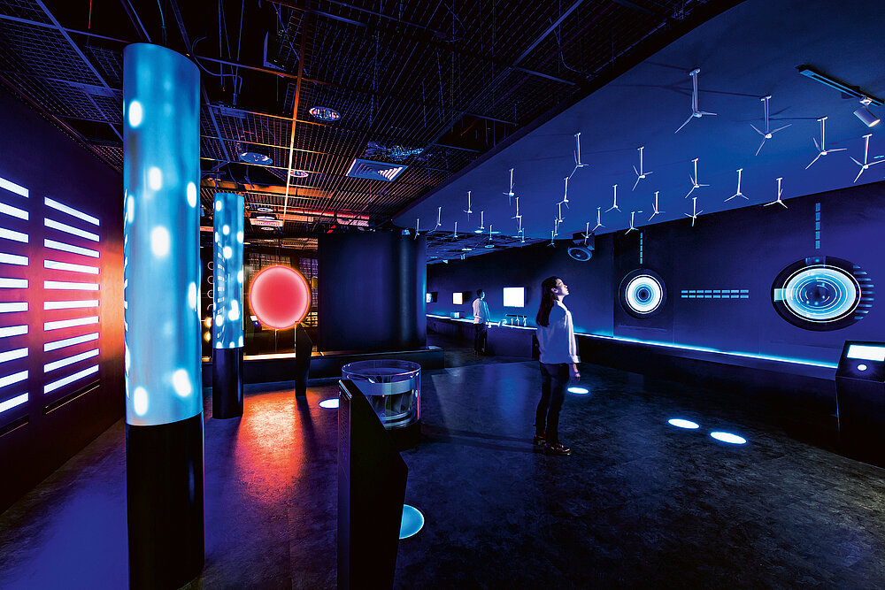
Spatial Design

TAIPOWER D / S ONE

返回 Download

The design of the TAIPOWER D / S ONE public facility experience centre visualises the statements of “electricity” as the core, “current” as the operation, and “electrical energy” as the significance of influence. The symbol of lightning is presented in simplified straight lines and fillets that communicate the message of energy savings. This has been interpreted by the “exclamation mark” and “slash” signs as key elements of the visual design. The aim was to turn the concept, knowledge and aesthetics of “intangible power” into a new place easily accessible by the public.

Red Dot

Others interested too