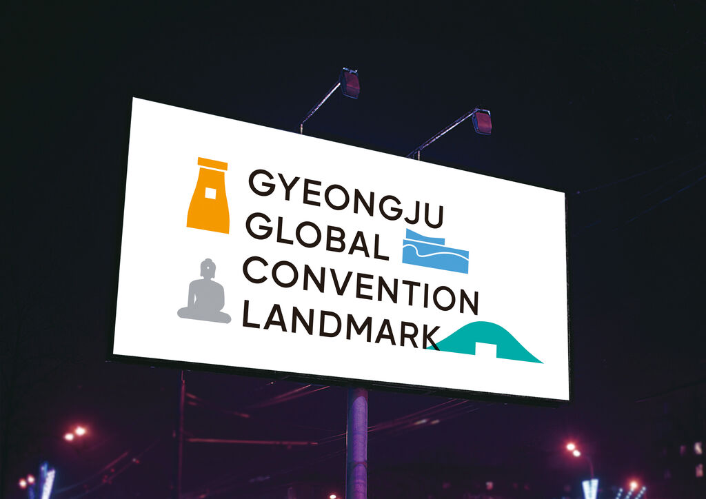
Brand Design Relaunch

Rotwild

返回 Download

The redesign of Rotwild, a premium brand in the mountain bike sector, updates the brand by intensifying and reinforcing its core values. Based on the definition of the brand’s core values, the relaunch reorganises the design elements and combines them in a design manual for the first time. The result is a corporate design that allows greater freedom, while nevertheless preserving the brand’s technical and aggressive image. The word mark and image characters have been revised to emphasise robustness and stability. A new visual language and brand colour scheme as well as a new framework design are a striking representation of the brand’s masculine, engineering-based background.

Red Dot

Others interested too