Corporate Identity Relaunch

M6

返回 Download

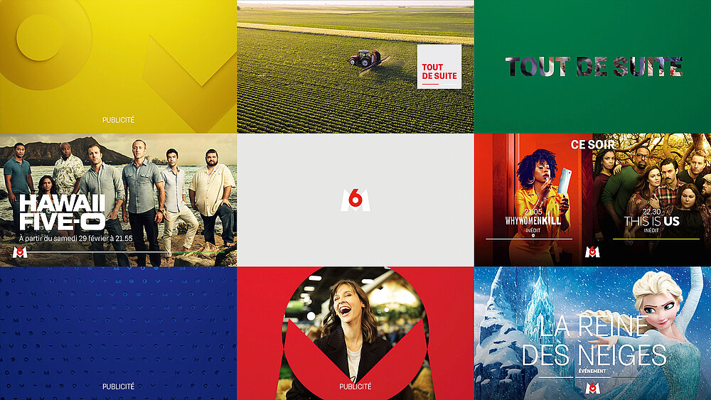
The new identity of the fully digitalised French private channel M6 eschews traditional TV graphic codes and returns to its roots by revisiting its original logo design. Through a constantly moving graphic system made up of geometric shapes, the focus on the icon creates a seamless, fluid experience that revolves around a multitude of variations. The relaunch extends beyond the TV screen to include all formats, whether print or digital. To achieve this, the behaviours of a digital brand were used in the sequencing of the different elements that make up the on-air flow and a graphic kit was developed for daily use by the teams. In addition, spaces have been created for dialogue with the public, showing M6 as an engaging and appealing brand that constantly innovates, surprises and responds to events that matter to the French. A kit was also developed that allows the station to react to an event on air and digitally within a few hours and even create an event jingle.

评审团评语

The rebranding of the French channel M6 impresses with its smart play with identity. Its logo is constantly changing, with numerous shapes and rhythms offering a high degree of flexibility and variety in use. The way the number and the letter are constantly linked is not only well and attractively implemented, but also conveys the station as a vibrant brand that encompasses radio, print and online.

Red Dot: Best of the Best

Others interested too