Brand Design

La César

返回 Download

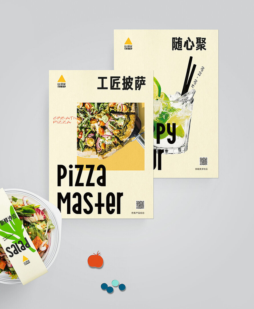
The La César pizza brand intended to launch a new generation of restaurants with a cross-border offer that meets the diverse needs and tastes of consumers. The brand design for the multilayered combination of different modules, materials and media – from the shop fittings, packaging and signage to the menu, clothing and online presence – required a strong versatility while maintaining consistency in the visual system. The concept follows the premise of “simple and concise, open and flexible” and uses abstract, irregular shapes derived from typical foods such as vegetables, pizza slices or pasta, lending them a soft, monochrome look and playful character. In addition, vintage-style English fonts were designed to harmonise with the overall look of La César, making the brand appear more unique from within its visual design. The brand colour retains the bright yellow of the durian fruit and adds greyscale black and milky white. The clothing is inspired by uniforms and streetwear and includes one model for the warm season and one for the cold season.

评审团评语

The brand design for the Chinese pizza chain La César captivates with its almost rebellious play with shapes, fonts and styles and stands out precisely because of this strange and irregular mix. The resulting aesthetic, which in turn is underlined by a uniform colour scheme in fabulously subtle tones, is highly original and exceptional for a restaurant chain.


Red Dot: Best of the Best

By starting the video, you agree that data, e.g. your IP address, will be sent to Vimeo. vimeo.com/privacy

Others interested too