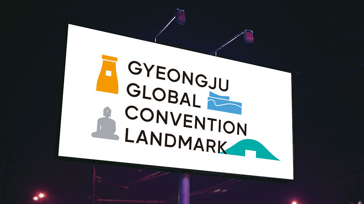
Client: Gyeongju Hwabaek Convention & Visitors Bureau, Gyeongju, South Korea
Brand Identity
arts de barbier
This brand identity combines the professions of a barber and art. Designed in a clear and modern way, the identity shows a concept made in one unit. The visual identity is based on the similarities between the barber’s profession and art, including, aside from creativity, also the utensils, such as a shaving brush and an art brush, a hair dying can and a painting can, or the colour palette. The dominant colours are blue and reddish brown, which in combination with the logo and a naively drawn face ensure brand recognition. The logo was created from the letters “A” and “B” that also refer to the two professions: the “A” forms the tip of a pencil and the “B” features the teeth of a comb on its left side. When unfolded, the posters – forming one among several brand elements – show the abstract face of the brand identity with a beard or with hair, both of which seems to grow out of the paper, underlining the artistic approach of “arts de barbier”. The brand image is complemented by the slogan “Art is always nearby”.
评审团评语
Consistency paired with originality and wit – these are the outstanding characteristics of this brand identity. The unusual idea of combining the professions of barber and artist have been rigorously implemented and applied in a sophisticated and artistic manner to all elements ranging from the logo and stationery to the promotional items.
参与人士
-
Design:Seungkwan Kang, Heekyoung Kang, Taejin Lee, Jihye Kim, Inkyung Moon, Seoul