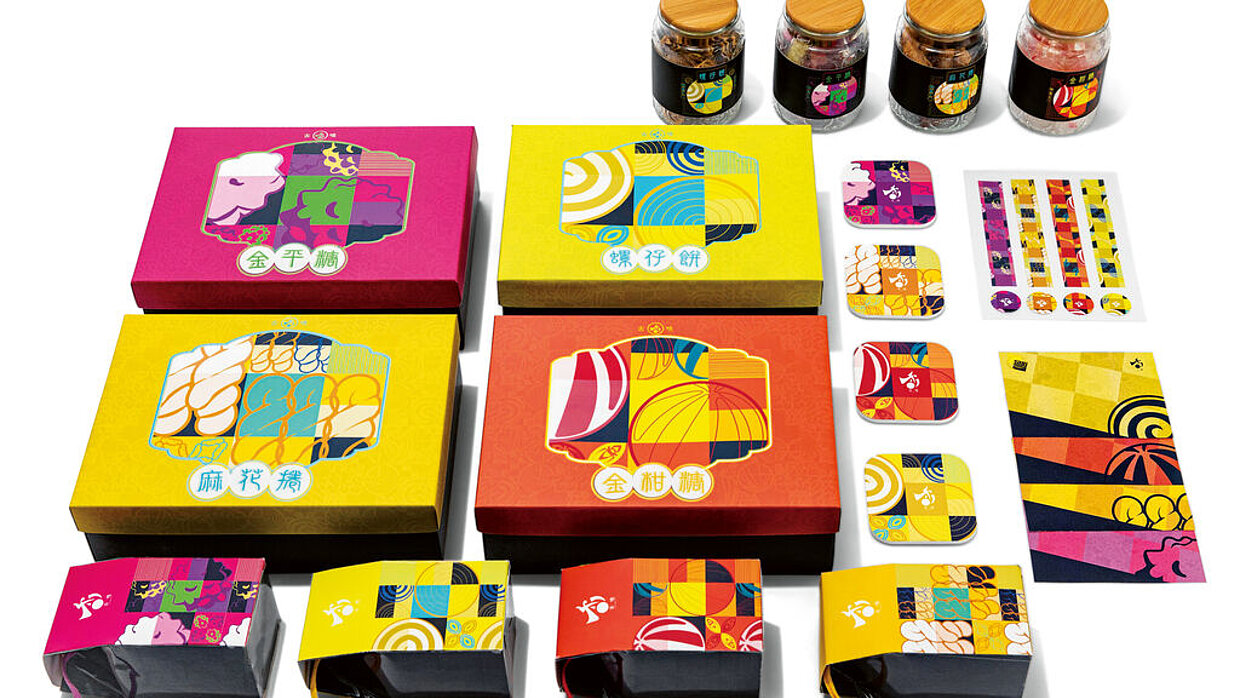
University: Chihlee University of Technology, New Taipei City, Taiwan

评审团评语
Visible Acoustics, Many designers have attempted to translate and visualise music, to make it visible to the eye and thus render a different sensual experience of the vibrations, the rhythm and the feel of music. Designer Sarah Müller has also ventured into this territory – however, she opted for approaching her project in a highly distinctive, meticulously mathematical way. The result is an outstandingly vivacious, interactive work that allows re-experiencing George Gershwin’s “Rhapsody in Blue” in a novel way, and an immersion together with the composer in 1924 New York – with audiovisual added value. , , Alongside a documentation of the project, she created an 18-metre-long leporello featuring 462 bars that evoke an infinite skyline expanding in front of the viewer. The graphical translation is based on staves generated from the composition by using Java processing – a purely analytical approach, yet one that also provided ample creative leeway for the designer. The lines were modified according to parameters such as dynamics, rhythm and dramatic theory, with a grid reflecting the 4/4 bar pattern of the musical piece and a format reminiscent of a record sleeve. In addition, Sarah Müller assigned colours to each of the fifteen instruments – not at random, but instead by using colours that defined the city of New York in 1924. The grey of concrete facades, for example, thus symbolises the piano, while the brownish red of building bricks visualises the sound of the saxophone. Having the graphics expand and retreat along with the music not only makes the composition visible, it also allows experiencing the music’s dynamism. Tracing the “Rhapsody in Blue” bar by bar with a note ruler is a truly captivating experience and simply fascinating in light of how design can go beyond the purely visual. , , Finally, the project is complemented by an overall coherent packaging. The slipcase, which protects the heavy volume almost like an instrument box, has been deliberately shortened by the designer to express the dichotomy between musical rigour and improvisation that defines the composition. The use of linen and grey cardboard visually reflects the contrast between classical music and jazz. Form and content thus have merged into a coherent whole – no element is superfluous – a finely tuned balance amidst a strong graphic appearance that avoids competing with the musical composition and convinces on all levels. , , The jury praised the highly analytical approach taken by the up-and-coming designer who, despite the stringent clarity of her work, has managed to make it deliver an outstandingly emotional experience, and thus demonstrate the core of graphic design in the best sense: as the visualisation of the invisible.
