

Loading...

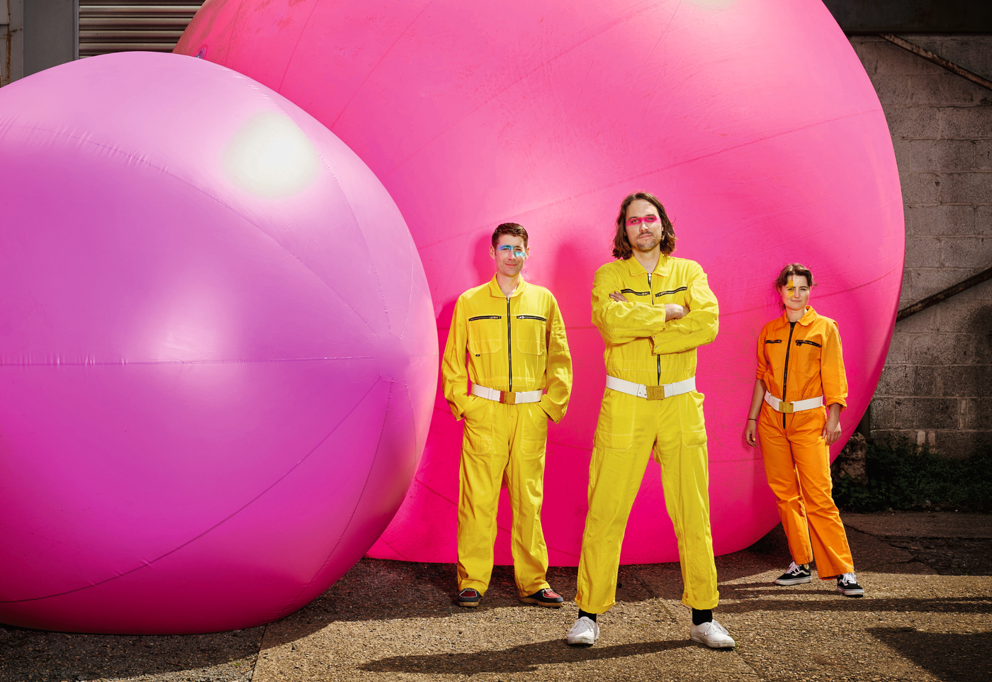
Menge Gruppe

oppa franz is committed to its location in Duisburg and aims to change things for the better. The creatives working there combine content with emotion, move people with humour and exceed client expectations or, as they themselves put it using the words of TV chef Tim Mälzer, “the customer is king in a realm where we are the emperor”.
Red Dot: Achieving a big effect with a small budget – how do you do that?
oppa franz: It was clear that the further elaboration of the individual media would be done by the client and that the design concept would be used for several years. We therefore developed a modular system that makes it easy even for untrained designers to create changing, aesthetic and recognisable patterns.
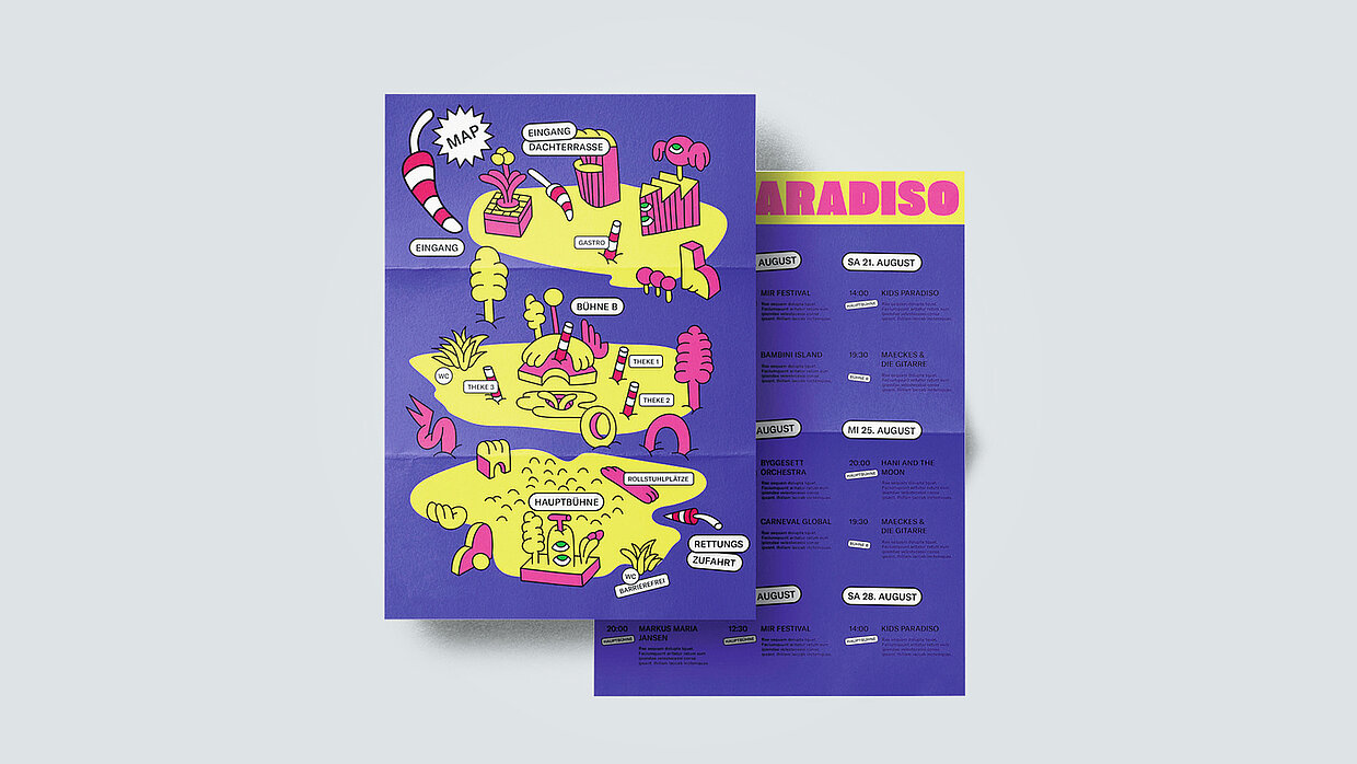
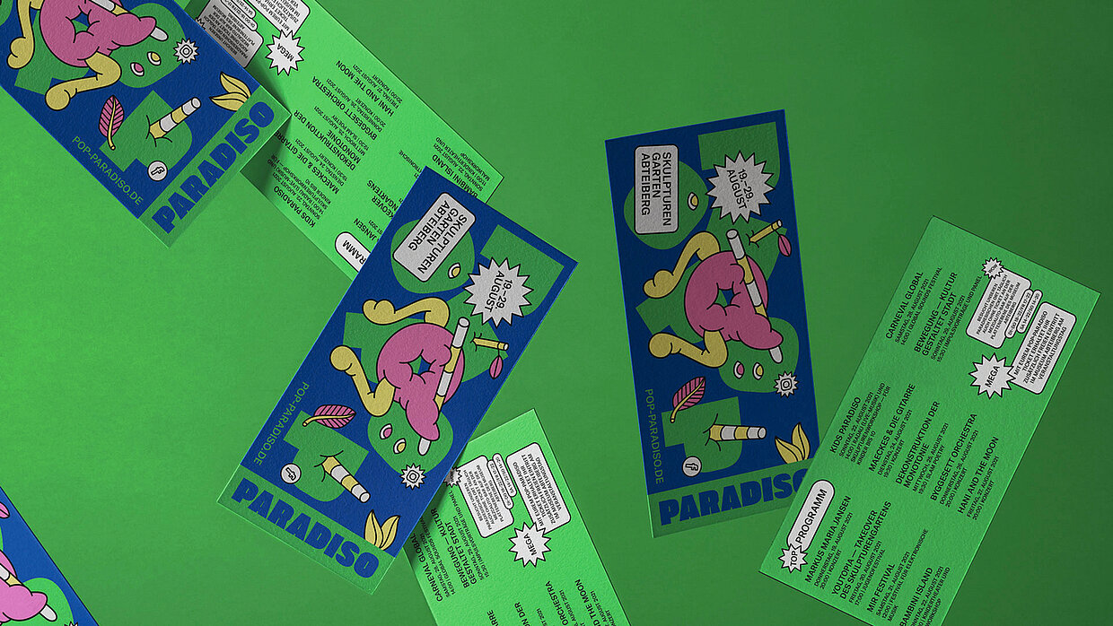
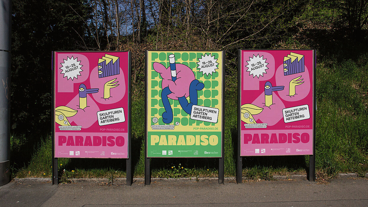
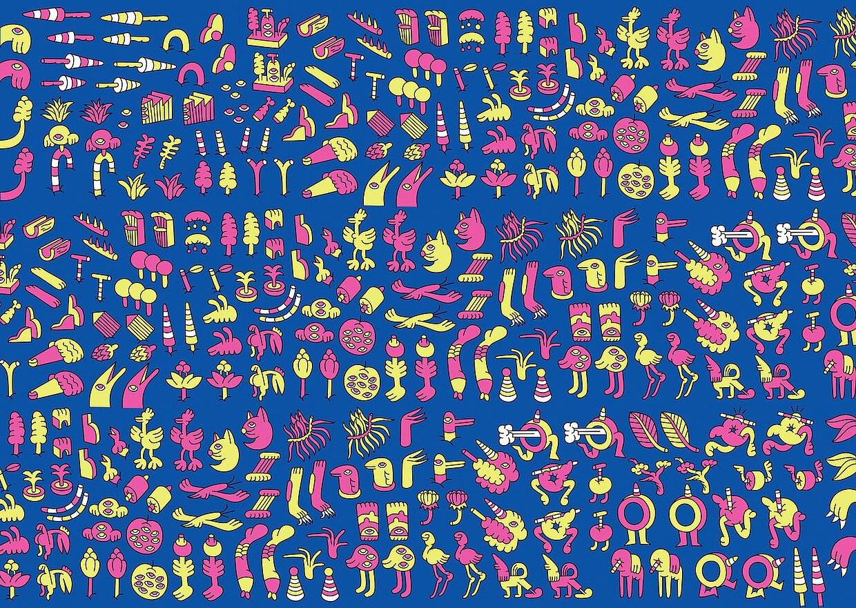
“POP PARADISO” looks like a lot of fun. Was it really?
The client came to us with a clear idea of visualising a version of paradise through illustrations. The biggest challenge was to develop a design that would allow the illustrations to be the heroes while, at the same time, creating a brand that would be very distinctive and have high recognition factor. We therefore turned the logo and the brand itself into the Garden of Eden in which things flourish and luxuriate. Once we had done that, everything else fell into place and it was huge fun to put all the elements we had predefined into the required formats and find out what was achievable with the whole layout system before it fell apart.


