With 50 employees, Zeichen & Wunder is one of Germany’s leading brand agencies, and it also offers analogue communication at the highest level. With a keen sense for haptics and materials, the creative minds surprise their clients time and again with ideas that are literally touching. The poster series for Bayerische Hausbau shows how clever illustrations, a sensitive approach to the format, and brilliant printing can create eye-catchers
Interview with Zeichen & Wunder
Red Dot: What specifications did Bayerische Hausbau approach you with for this poster series?
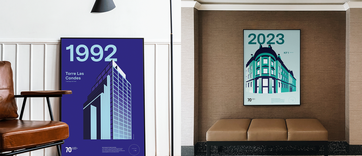
Zeichen & Wunder: The posters are a gift from Bayerische Hausbau Real Estate to the Schörghuber family of entrepreneurs, who are behind the investments in the properties depicted. Since its founding 70 years ago, Bayerische Hausbau has realised 26,000 flats, 1,500 houses and millions of square metres of commercial space in Germany and around the world, including spectacular signature buildings such as the twin towers of Deutsche Bank in Frankfurt or the Arabellahaus and Arabellapark in Munich. In the anniversary year, we wanted to present the properties with the most exciting development histories in such a way that their uniqueness is expressed just as much as their togetherness. Indeed, despite their diversity, the buildings have one thing in common: they tell stories of the company’s courage and creative drive. And they are a piece of the city’s history.
What made you decide to focus on illustrations?
We set ourselves the task of bringing together architectural styles from different decades in a series. So our designers created illustrations that have an almost iconographic effect. This is because they slightly exaggerate the typical features of each building and leave a lasting impression – both as individual objects and as a whole. The strength of these illustrations lies in the deliberate exaggeration of the objects, which results from the unusual perspective, the clear lines and a strong effect of depth. Hence, each motif is given its very own character. But we also wanted to express a bit of a twinkle in the eye with the directness of the exaggeration, which is almost a little dramatic. After all, we are aware that there is something else that unites all buildings: they should be made for the people who live, work and reside in them. We are realising this idea in our current work for Bayerische Hausbau Real Estate.
Is the poster sometimes underestimated as a medium nowadays?
The oversized format has an unimagined effect, especially today, due to its luminosity and when used in a series. The limited edition also awakens desire – the response was extremely positive.

