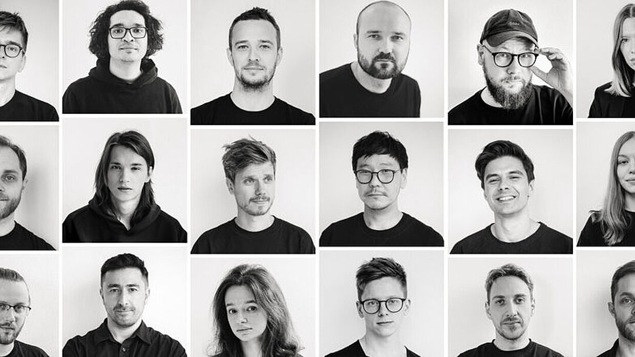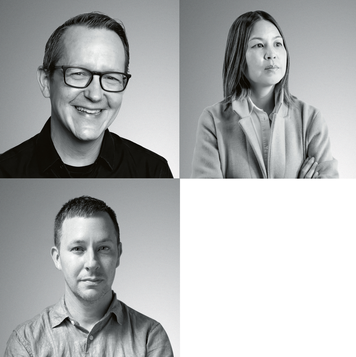
Founded in 2018, the Clarity studio develops competent, creative and user-centred design solutions for its clients. Leveraging a strong creative network, including Airlift, Clarity builds bespoke teams to develop design strategies, products and intuitive physical and digital experiences. In 2021, Clarity joined the leading San Francisco-based design studio Box Clever.
Interview with Clarity x Airlift
Red Dot: You designed the user interface for the ZEISS Xradia 630 Versa X-ray microscope in a customer-focused and human-centred design process. What was the biggest challenge?
Clarity x Airlift: Culture was definitely a major challenge. We started our relationship with Zeiss having no prior knowledge of microscopy. At our kick-off meeting with the client, we encountered a room full of sceptics, arms crossed, wondering how we as outsiders could make a difference. But ultimately it wasn’t about us – our bespoke methodology put the user at the heart of our approach, allowing us to unlock the hidden potential of the underlying software. We took Zeiss on an iterative journey, using empathy, design and build-to-learn methods to develop the innovative NavX software experience – and that helped us to turn sceptics into collaborators.
How does your design support the user experience?
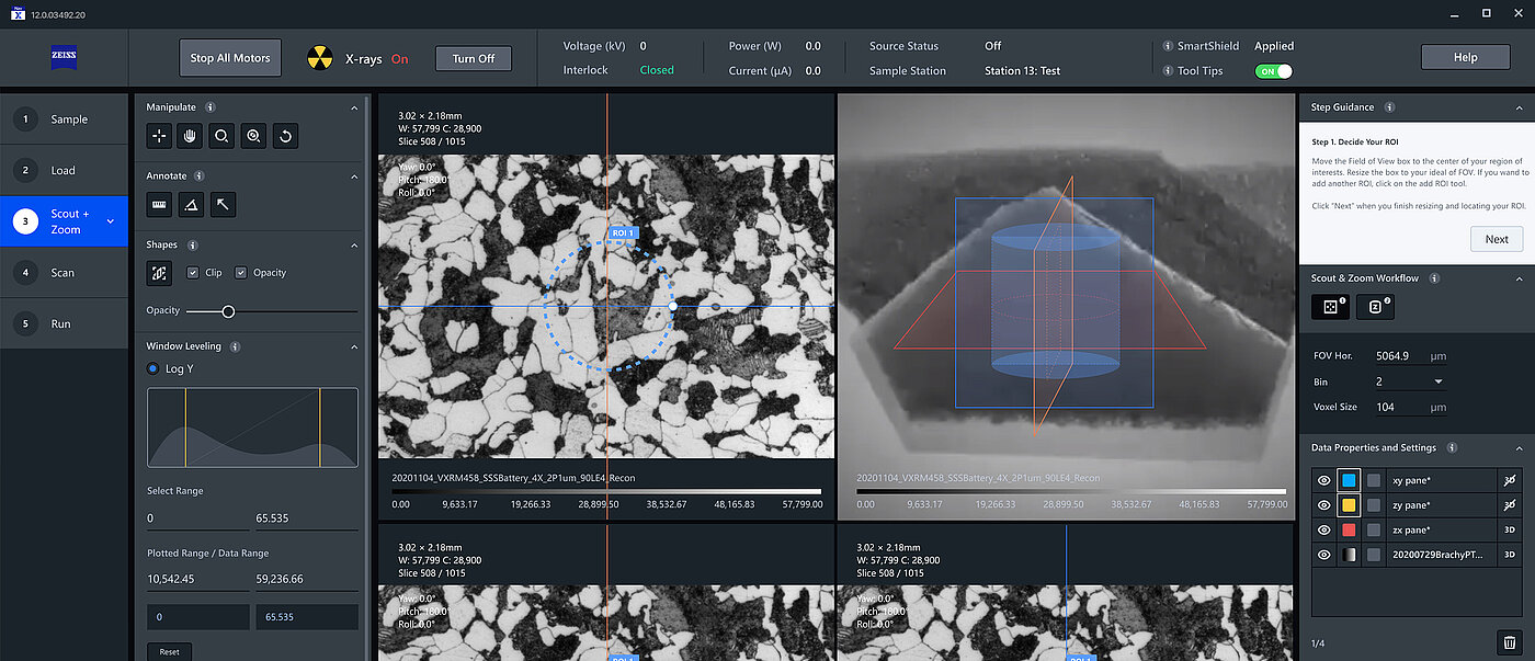
Our discussions with users gave us the insight that the overly technical user interface performed very well, but that visual complexity was a barrier to comprehension and adoption. So we identified a core set of pain points and were able to align with the Zeiss team on the areas where improvements were needed. For example, we leveraged AI to overcome one core pain point and designed a new AR overlay to improve control. We introduced visual order with an underlying grid and spacing, and developed a visual hierarchy based on a refined colour palette, modern fonts and an optimised icon library.
What did you learn from the project as designers and design researchers?
It was a multifaceted project and Zeiss understood that you have to commit to thinking differently if you want to achieve a breakthrough innovation. The first half of the project was about immersion into the world of microscopy, the technical language and processes. The second half was about realising the vision of a better and more user-centric way. Being honoured with the Red Dot: Best of the Best award is recognition of the key principles of our approach: Listen to learn. Commit to design excellence. Develop clarity from complexity.

