
“Barely there” – Red Dot winner Markus Temming talks about award-winning eyewear brand MARKUS T
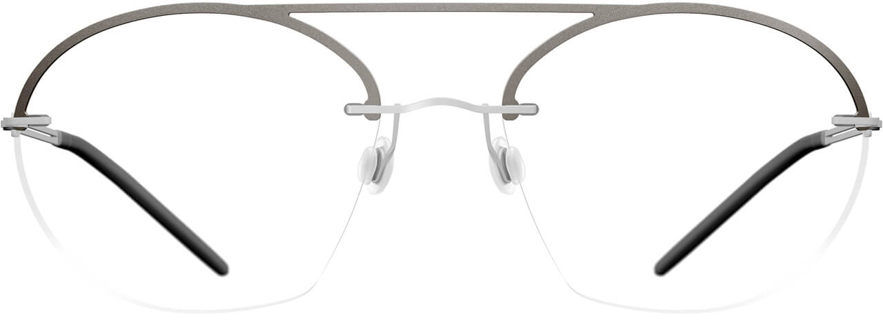
The eyewear range from MARKUS T embodies lightness in all of its facets. The glasses are puristic, filigree and expressive. Technical details such as the screwless hinges and robust materials like titanium make them particularly durable. The company has won 13 distinctions in the Red Dot Award: Product Design since 2000 for its strong design achievements. In 2020, the jury awarded a Red Dot to the EASE collection, which features rimless models that offer countless individualisation possibilities despite an impressively reduced design.
Red Dot spoke to designer and managing director Markus Temming about purism and the ensuing design challenges. Head of Marketing Sandra Rohrbeck also provided insights into what it was like to take part in the Red Dot Award.


Red Dot: What does MARKUS T stand for?
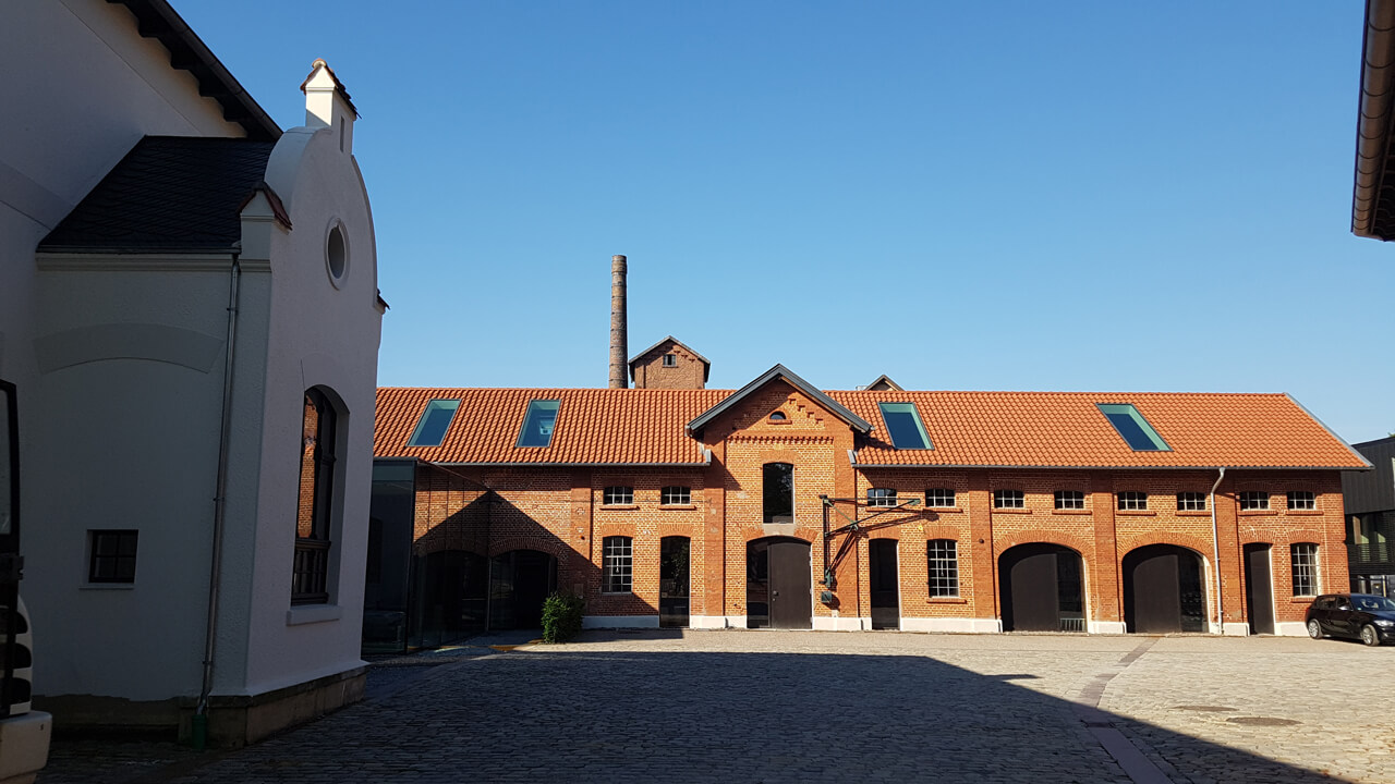
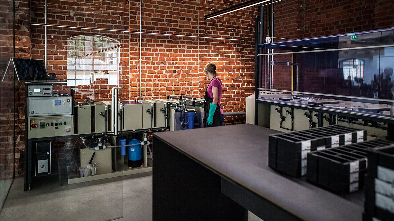
Markus Temming: MARKUS T stands for honesty, simplicity and consistency. The brand marries my personal and professional ideals. From the design to development and manufacturing, we cover everything under one roof here in the workshop in East Westphalia. I didn’t want to have to resort to existing techniques. I wanted to be free in my ideas.
What three words would you use to describe your eyewear range?
Temming: Our glasses are light. And I don’t just mean lightweight. They also encompass the many other meanings this word has – for example simple and uncomplicated. Furthermore, they are consistent. And they are exceptionally understated. We don’t have any product that jumps out at you. Instead, you need to put on the glasses in order to appreciate their distinctiveness.
Why is purism so important to you?
Temming: Purism is a way of life. For me, it is synonymous with honesty. When we see an image of an older lady, it’s wonderful if we can look at her features and appreciate the traces that life have added to her face. There is beauty in so many details that do not need to be concealed. This is what we believe, and it also influences our designs. We like to show off our technique. We reduce it to the minimum, but then we do like to show what’s left. We don’t dress anything up.
How can this honesty in design be conveyed?
Temming: We work with reduced screwless hinges, for example. We always endeavour to optimise what we have and to go back a few steps instead of always pushing the boundaries further. For us, the products become more aesthetic when they focus on what is essential and incorporate the function to make it a fixed part of the design.
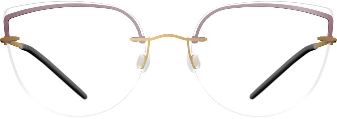
You won a Red Dot for the EASE collection. What is it that makes the products special?
Temming: I always considered rimless glasses to be a particular challenge. Existing models did not meet my standards from a technique or a design perspective. So we took on the task of reducing rimless glasses even more, while at the same time making them more interesting. We worked on that project for many years. We wanted to design a special product that matches our portfolio. The result was a collection that embodies a playful lightness. We produced glasses that are ‘barely there’. And yet they are interesting, because they have elements such as titanium applications or contour rings that play with shapes and create nuance. This is also achieved through the different colours. It means that we took an almost invisible collection and gave it so much character that everyone can find the right glasses to suit their personal taste. This was something that had never been done before with any other collection.
What were the challenges in reducing the design?
Temming: It is extremely difficult to achieve absolute reduction to perfection. Reducing small connections that need to last for the entire lifetime of the glasses and longer is complicated because of our minimalist production techniques. Also, it’s not just about looking good but about being able to see well. No part of the glasses should be in the way. One of the things we did was to develop a special glazing technique that works even for the tiniest surface. The biggest challenge was the desire to integrate diversity and a playful lightness. That’s the only way to make it fun to work on the glasses and ultimately to wear them.

Why did you enter the collection in the Red Dot Award: Product Design?
Sandra Rohrbeck: Anyone can claim to have made a well-designed product. But receiving such a well-known award from an independent jury of experts is an important confirmation as well as good publicity for our brand. We are particularly proud of the fact that the jury members assess technique as well as aesthetics.
Did the experience of taking part in the competition meet your expectations?
Rohrbeck: It was especially nice for us to receive an award for such a new, bold and different collection. This was proof that the hard work had paid off. Red Dot is well known to industry insiders and to end customers alike. We benefit from this image transfer and from the Red Dot Label, which we have used in various channels. The positive response, especially on social media and from opticians, has shown us the impact of the award.
“Winning is the Beginning” – winning a Red Dot is generally the beginning of a success story. To what extent is this true for MARKUS T?
Rohrbeck: We never rest on our laurels. We are proud to spread the news of our Red Dot win, but we also see it as an incentive to constantly do better and to reach an even higher level.