![[Translate to English:]](/fileadmin/_processed_/d/b/csm_91-00989-2022BC.0837165_CO_d1ee71a5ec.jpg "[Translate to English:]")
Ling Tung University — Giving Clothes a New Lease on Life
Designer profile

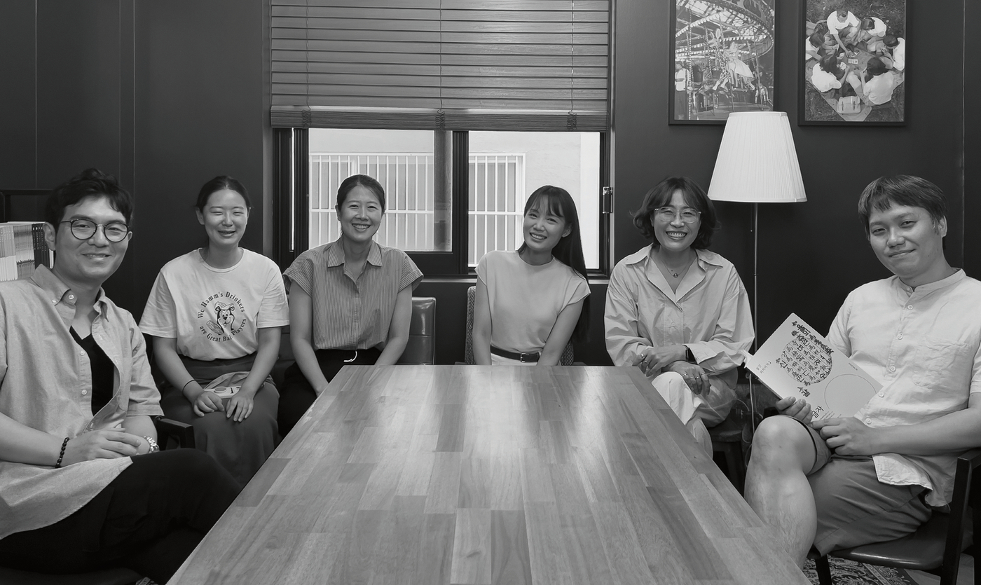
Yunjung Park is an assistant professor at the Graduate School of Techno Design at Kookmin University in Seoul, after graduating with a major in visual communication design from Typo Design Lab, part of the university’s visual communication design department. He is the CEO of PYJ & TypoLab Co. and executive managing director of the Type Design Center of Yoon Design Co. Honours and awards he received include the Red Dot Award: Brands & Communication Design in 2019 as well as the iF Design Award Communication Design in 2018. A year earlier, he was winner at the GRANSHAN International Type Design Competition. Anna Jo holds a PhD in design from the Graduate School of Techno Design, Kookmin University, and also completed her major studies in visual communication design at Typo Design Lab. In 2020, she won the Areum Prize at the 28th Hangeul Font Design Contest. PEACHMARKET is a collective of creatives at the Socio-Cultural Design Institute of Kookmin University that develops various formats of content written in simple sentences. They are designed especially for people with learning difficulties who need books and information they can easily understand.
Red Dot: To what extent do you think new technologies are changing design?
PEACHMARKET: New technologies make it easier to solve design problems. In our case, we use eye-tracking devices to measure the eyes of people with learning difficulties. This made it possible to determine what type of letterforms are more legible. Based on this, we were able to design the “Peachmarket” font.
How would you define good communication design?
Good communication design always provides functional, practical and attractive effects.
What makes your work unique?
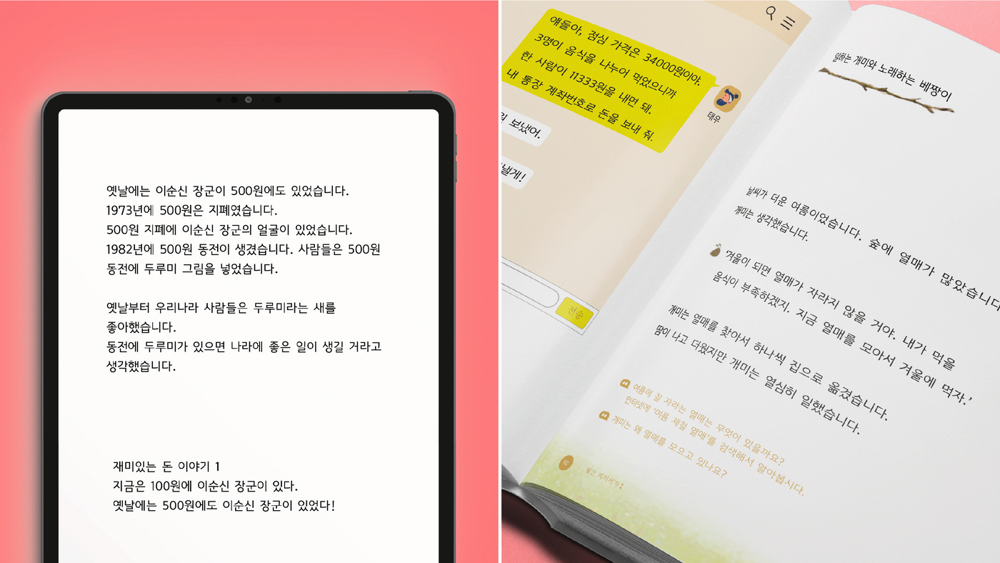
“Peachmarket” is the first and only functional font to people with learning difficulties in the Republic of Korea. Instead of developing fonts with the general but same methodology, we conducted quantitative and qualitative experiments to improve the legibility of the font for people with learning disabilities. We met and observed 30 people with learning disabilities in person and proceeded various experiments. Based on the evaluation scores obtained through the Delphi method, the experiments were examined and analysed using physical (eye-tracking), behavioural and scientific (misreading check), subjective and emotional values (survey, in-depth interview).
What intention do you pursue with your award-winning work?
It is our hope that people with learning disabilities will be able to read and recognise words clearly through this font, and thus improve their quality of education. The font has been developed so that it can be read clearly without confusion. It improves literacy in a practical sense, so that people with learning disabilities are given the chance to acquire information – just like people without these difficulties – and it is also made easier for them to communicate in society. The font is already used in textbooks, books, online content for people with learning difficulties and special needs across the country.
Was your award-winning work inspired by current social issues?
We are inspired by social issues, such as people with learning disabilities, who are categorised as having below-average cognitive abilities and generally have an IQ of 71–84. The term “people with learning difficulties” refers to all people with reading difficulties, including people with developmental disabilities and borderline intellectual functioning (BIF). The font is already in use, distributed to special needs classes at 800 institutions nationwide and used in various content (textbooks, books, SNS, e-books, web).

