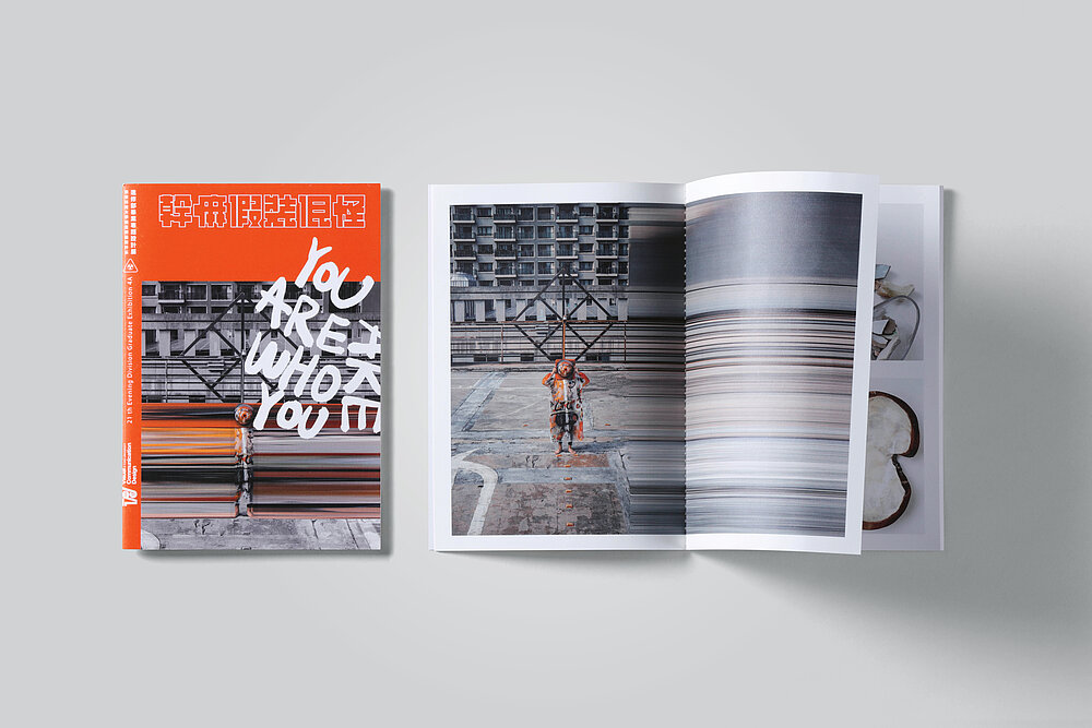
What will I look like in the future? How will I be affected by the environmental changes which are currently taking place? Who am I? This project translates existential questions into a highly experimental identity. The brand’s logo is reminiscent of the symbol for radioactivity. Thus, it not only refers to energy and progress, but also to fear and destruction. Photos, patterns and graffiti were also used to reflect ambivalent feelings and mixed with bright orange to achieve a distinctive look. With its expressive lines, the brand conveys an impression of the post-90s generation’s attitude to life.