Corporate Design

SPLENDOR

Back Download

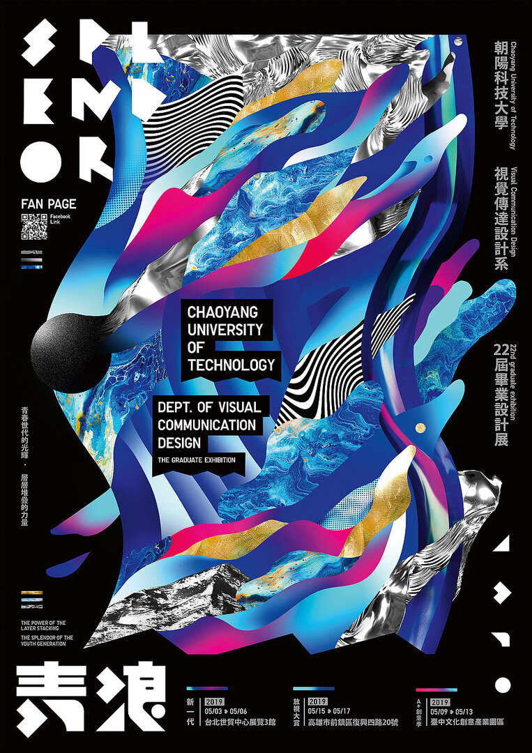
The idea behind the corporate design of “SPLENDOR”, the 2019 graduation exhibition of the Department of Visual Communication Design at Chaoyang University of Technology, follows the motto that “a drop of water will not dry up when it is in the ocean” – an idea which, when transferred to human beings, means that people are the strongest when they are in a group. The project symbolises the group spirit of teamwork in which everyone with his or her individuality contributed to creating every single detail of this visual identity for posters, videos, stickers and packaging, and together as a group made it unique and, in conjunction with the other elements, form an interesting, multilayered unity. Thus, the visual elements are characterised by a wide variety of graphic forms, colours and structures that can be rearranged over and over again. They were created in experiments with pigments, photographs, 3D materials, ink and vector graphics and express the possible variations of communication design.

Statement by the Jury

The corporate design for the 2019 graduation exhibition convinces with its heterogeneous ­design, which not only makes the various elements of the appearance recognisable and clearly identifiable. It is also through its colourful and multiform elements, patterns and graphics that it concisely reflects the message that individual strengths best play out towards excellence in teamwork.

Red Dot: Best of the Best

Others interested too