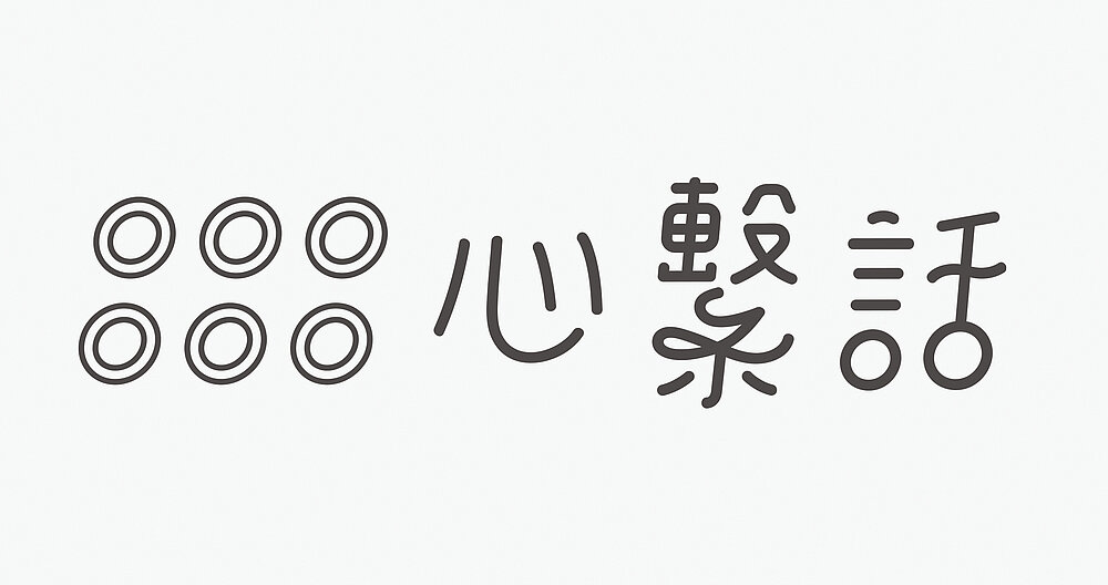
The OOOOOO Studio aims not only to convey the beauty of spiritual connections between people, it also seeks to transmit emotions by using patterns beyond language and to create a visualisation of the essence of design through knotting art. Long before the development of written languages, knotting was an important way for people to make records and convey messages. For this brand design, each colour has a specific meaning, for instance grey represents calmness and yellow represents pleasure. Inspired by the art of knotting, holes are the main feature of the logo, using the letter O in an arrangement of six circles.
Credits
University:
Ming Chuan University, Taoyuan, Taiwan
Supervising Professor:
Ching-Jung Fang, Chien-Hua Lin
Design:
Yi-Chieh Chen, Ting-Yu Su, Ting-Yu Chang, Hung-Yi Lee, Ming Chuan University