Typeface Design

Odense Teater Typography

Back Download

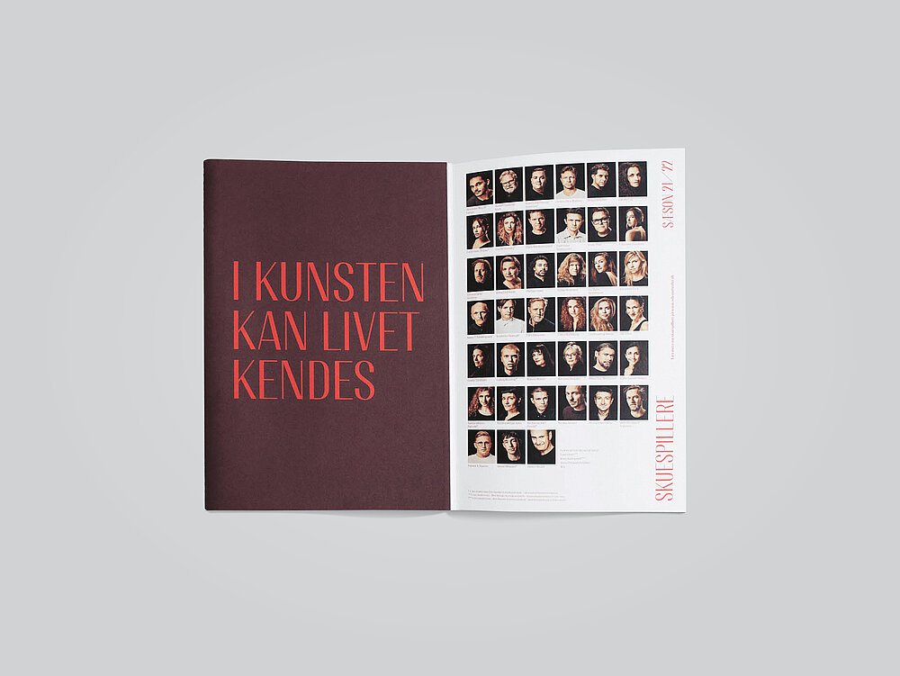
The Odense Teater Text and Odense Header typeface was developed as part of the new identity for Odense Teater in Denmark. The typeface is inspired by the majestic-looking doorways and high, slender arches of the neo-baroque theatre building, whose facade is characterised by three windows directly above the still-original solid wood doors. Accordingly, its slender, elegant silhouette is expressed in the clear, narrow and tall letters, predominantly in capitals, which also characterise the striking, purely typographic logo. The new typeface is also inspired by and reflects the meaning of the historical saying “I kunsten kan livet kendes” (In art one sees life), which is written above the stage. With its thin strokes and soft curves, it is clear and easy to read and has a contemporary character that exudes permanence and openness. The resulting elegant and appealing typography should not lose any of its quality and modernity in a few years’ time and blends harmoniously with the theatre’s analogue and digital communication media.

Statement by the Jury

The typography of the Odense Teater captivates through the skilful combination of a classical impression with the aesthetics of modern type design and Scandinavian style. The reference to the architecture of the stately building is reflected in the elongated letters and soft curves, which harmonise perfectly with the lively presence of the theatre – an expressive typeface that works across all media.

Red Dot: Best of the Best

Others interested too