Let Your Heart Lead is a response to a very real need as women all over the world suffer in silence from the grief associated with miscarriage. It provides something different from the design tropes of existing grief‑based materials that either try to comfort with soft‑focus floral imagery and script fonts, or that try to explain with impersonal text‑heavy, information-rich content that’s medical and diagrammatic. Instead, Let Your Heart Lead does not over-intellectualise grief; the materials respond to the unique, messy and non-linear nature of the subject.
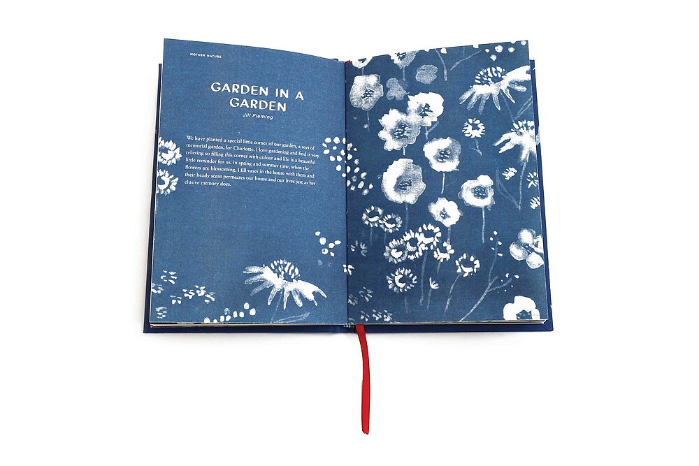
The collected stories and passages of text in Let Your Heart Lead are accessible and remain non-judgmental, holding the view that all forms and expressions of grief are normal but not trivial. Storytelling of this nature provides the audience with anecdotes that are relatable. The visual style of Let Your Heart Lead is unapologetically outspoken whilst remaining sensitive to the subject. Blue watercolour paintings are overlaid with bold red crayon lines that express the quiet sadness of grief that is then metaphorically overlaid with hope and optimism for the future. Risograph, a somewhat haphazard print process, can lead to unexpected ink overlays and a stippling effect – this process echoes the content.
Typefaces are carefully selected for the right tone of voice. Gotham is fresh, contemporary and credible, while Fansy is a contemporary take on a script – it feels hand-drawn but it doesn’t distract from the illustrations. Sabon is a classic, elegant and familiar typeface. Haptic experience is central to all material decisions. Uncoated Dutch linen is used for the cover stock – uncoated, warm tone, 135gsm paper stock – complemented by a blue and white striped headband and a red bookmark. The book feels like a precious item to be gifted and treasured.
Red Dot Award: Design Concept | Concept | Visual Communication
Credits
Institution:
Massey University Nga Pae Mahutonga, The School of Design, New Zealand