Magazine

BIRD

Back Download

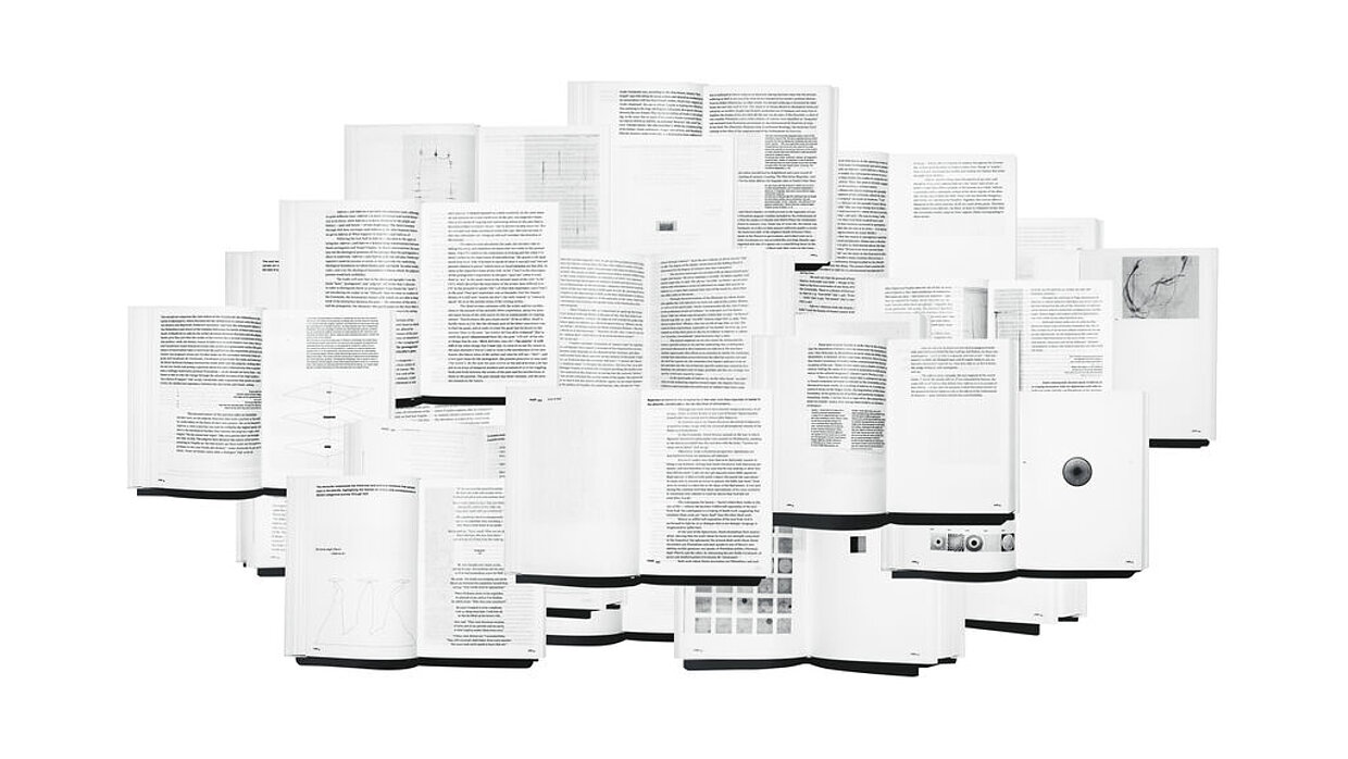
The task of BIRD was to develop and design the first edition of a monothematic magazine, targeted at an unconventional, creative audience. Following the aim of being surprising, sophisticated and inspiring in both content and design, the researched philosophical contents were transformed and visualised using unusual points of view and unexpected presentation formats. Featuring an overall clear layout, the photographs, graphics and illustrations stand in contrast to the typeface that is also rich in contrast and plays with its possibilities. A bird’s ability to fly has always been a symbol of freedom for humans, a freedom that the magazine examined in its various facets: how humans strive to achieve it, the boundaries and dark sides of freedom, and what it means not to be free. The magazine interprets the concept of freedom on 180 pages through a design that leaves generous blank space and conveys the topic in a light, filigree manner.

Statement by the Jury

The magazine meets the eye with its reduced design appearance. The design uses only one additional colour and therefore plays more with the typography and its relationship to the illustrations and photographs. The layout thus emerged as diverse and vibrant, portraying the topic of (bird-like) freedom in a manner that is highly impressive.

Red Dot: Best of the Best

Others interested too