Beyond the Hype – Logistics and Real Estate Study

Back Download

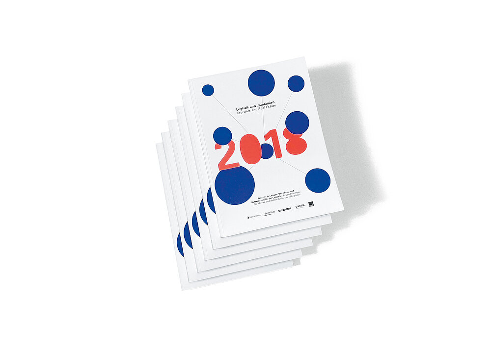
The question of how to make a complex and difficult topic transparent in the traditional environment of the logistics industry has been solved in the publication “Beyond the Hype. The Bread-and-Butter Business of Logistics” by creating a contemporary and appealing design concept. With the development of the “logistics cosmos”, an information and graphic tool was created to make the several-years-long logistics and real estate study accessible in terms of content. Introducing bubbles in a striking colour code of neon orange, royal blue and white, the tool consistently defines the entire publication in that it not only determines the structuring of content, but also becomes an identity-creating bracket and a leitmotif for an entire industry. Thus, it is strikingly made clear that the large volume business takes place at the gates of the metropolises. In addition, it is also thanks to the use of an expressive typography that the comprehensive results are presented to readers in a clear, objective and yet engaging manner that does not compromise on the quality.

Statement by the Jury

The design of this logistics and real estate study is an excellent example of what the successful use of colour can achieve and deliver. The rich blue and bright orange colours are recur-rent throughout the entire publication. They not only provide a clear structuring of the complex content but also facilitate an easy navigation through the scientific work, making the study much easier to read and understand.

Red Dot: Best of the Best

Others interested too