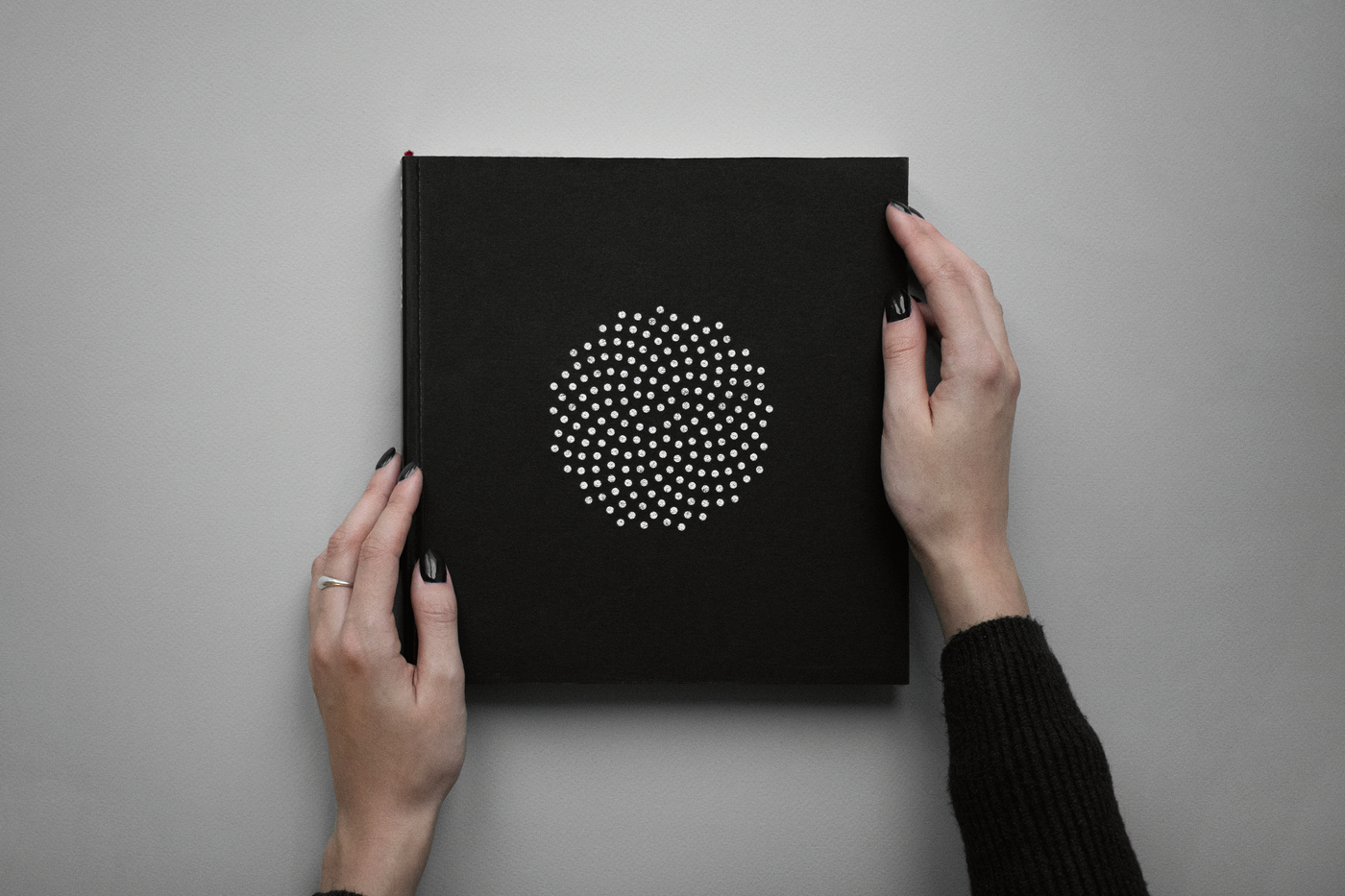
Plai Buro is a full-service creative agency based in Kyiv, Ukraine. It was founded by two women who are passionate about branding. Their work with typefaces, logos and corporate identities forms the basis for the agency’s development and has already won multiple awards.
Plai Buro in interview with Red Dot
Red Dot: There seems to be an above-average number of women working in your office …
Plai Buro: There is in fact a gender imbalance in the Ukrainian advertising industry. We are trying to change the situation in the creative business – we hire talented women and help them to reach their full potential. However we generally do not choose our employees based on gender or orientation, but on qualifications and human qualities.
Do you have a specific design approach to your work?
Our team begins by getting to the bottom of the issue and the context. We call it “the nerd approach”. We always look for multiple interpretations and play around with them. Everyone will notice something different in the project based on their background. We also avoid first ideas and analyse existing ones to fight mediocrity and plagiarism. We believe that content is more important than form.
What was the challenge in developing the visual identity of “What Is to Remember”?
To avoid commonplace ideas, we had to bypass previously used images. It was also necessary to turn the Ukrainian national symbol of remembrance – the sunflower – into a functional design element without losing its identity and expressiveness.


![[Translate to English:] [Translate to English:]](/fileadmin/_processed_/5/b/csm_91-01956-2022BC.0837263_CO_2_13daedad82.jpg)
![[Translate to English:] [Translate to English:]](/fileadmin/_processed_/a/0/csm_91-02748-2022BC.0837213_CO_ffec15b950.jpg)
![[Translate to English:] [Translate to English:]](/fileadmin/_processed_/d/5/csm_91-02746-2022BC_9361ad2e42.jpg)