Scandi style: award-winning communication design from the north
The Scandinavian countries are pioneers in many ways. Their export hits H&M, IKEA, Nokia, the Finnish sauna and Norwegian sweaters are well-known all over the world. They are trendsetters in both product design and fashion design. The importance of the Nordic countries becomes increasingly important in the field of communication design as well. Scandinavian design is functional, exceptional and intelligent. Scandinavian designers regularly prove that in the Red Dot Award: Communication Design. In 2017, they stood out again with design quality and creativity.
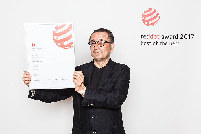
Gabor Palotei gets triple for Sweden
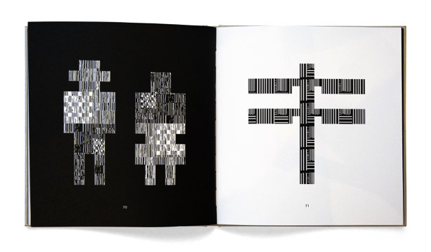
In the Red Dot Award: Communication Design 2017, the Swedish designer Gabor Palotei convinced the jury and received even three times the Red Dot: Best of the Best for his work. His book illustration “Gabor Palotei – Zoo” and the poster series of the same title portray around 30 different animals, including the human being, in an abstract way. They are depicted with sharply outlined bodies in contrast with a mesmerising ornament in light and dark. The black and white pattern of the animals creates the impression as if it is tactile. Moreover, they seem to be bound to their architectural outer form of their images, while their bodies are composed of undecipherable graphic ornaments.
The jury explains the decision to award the Red Dot: Best of the Best: “The illustrations of the animals convince with their completely different form of what we are used to seeing. Firstly, the reduced colouring in just black and white causes the viewer to look closer. Secondly, the particular pattern with its etching effect triggers curiosity. And finally, the simplicity of the illustrations is surprising. That sometimes less is needed to tell more strikingly comes true here in a genuinely playful and creative manner.”
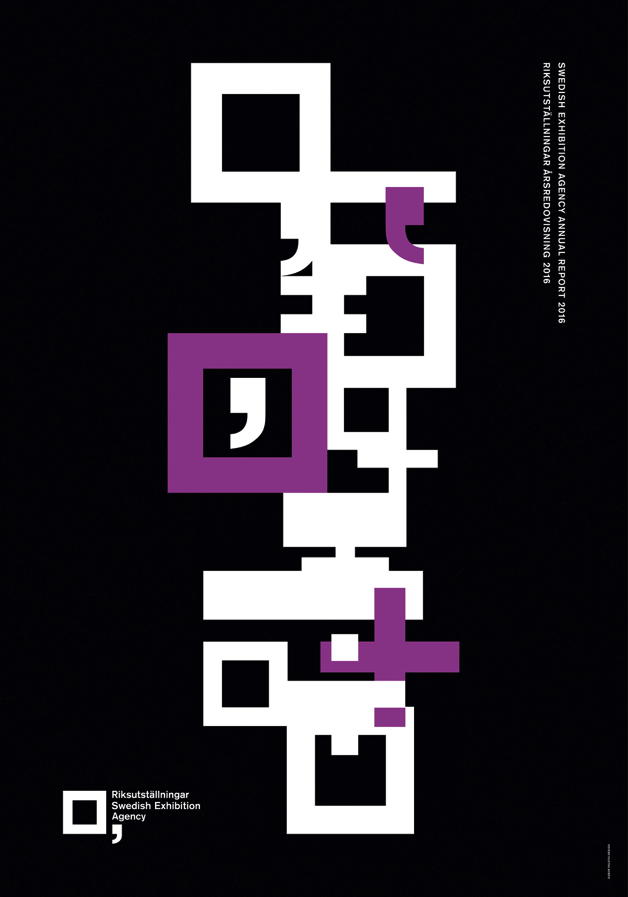
In addition, the designer received another Red Dot: Best of the Best for the poster series “Swedish Exhibition Agency”. It is an excerpt from the corporate design that was developed for the last annual report of the Swedish Exhibition Agency. The posters show graphic sculptures consisting of variations of the government agency’s graphic identity. The square symbolises a picture frame and the comma refers to the notions of continuity, development and involvement.
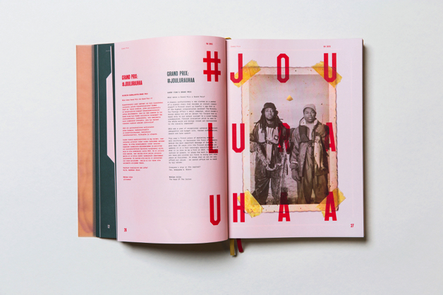
Kuudes: double for Finland
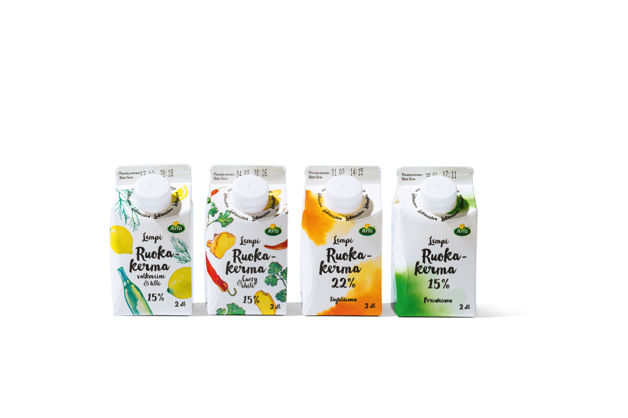
The Finnish design agency Kuudes received a Red Dot for the product packaging of “Arla Lempi”, a range of cooking cream, yoghurt and clarified butter. The simple packaging and the concise communication highlight the natural ingredients. In addition, they were honoured with a Red Dot: Best of the Best in the category “Brand Design & Identity”. The brand identity “Vuoden Huiput Champions” was created for the Vuoden Huiput 2015, a mix of competition and festival in Finland that has been organised by “Grafia - Association of Visual Communication Designers” since 1980. Under the motto “Design to celebrate champions”, the design strives towards lending the event a new sense of distinction and aesthetic.
The work focuses on John Sullivan, a box champion from the 19th century, who boxed without gloves. The aim is to convey the message that unshakable self-confidence can surely lead to victory. In analogy to this, the competition defines itself as a call to designers to unconditionally believe in themselves and their work.
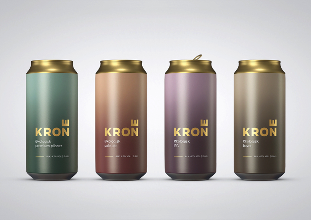
Creuna: double success for Norway
Also, the Norwegian agency Creuna won in the Red Dot Award: Communication Design 2017 the Red Dot two times. Their minimalistic packaging design “Krone Beer” displays the natural ingredients of the organic beer in a modern way. To put the focus on the simple frosted glass bottle, the graphics were applied by silk-screen printing. The puristic design contrasts with the name and the golden colour that hint at beer traditions and quality.
The agency also scored in the category “Brand Design & Identity”. The concept of the visual identity for DOGA (Design and Architecture Norway) presents a new logo, composed of four letters without visible focal point. The letters act as visual cornerstones which create shape and substance, depending on the point of view. The logo adapts itself to digital formats and those where motion is possible.
Submission in the Red Dot Award 2018
Designers from all over the world, next to those from Scandinavia, can submit their works into the Red Dot Award 2018 until 15 June 2018 and have their accomplishments evaluated by the jury. 24 members decide in a process spanning several days about the awarding of the Red Dot in 17 categories.
» Further information on the Red Dot Award: Communication Design 2018