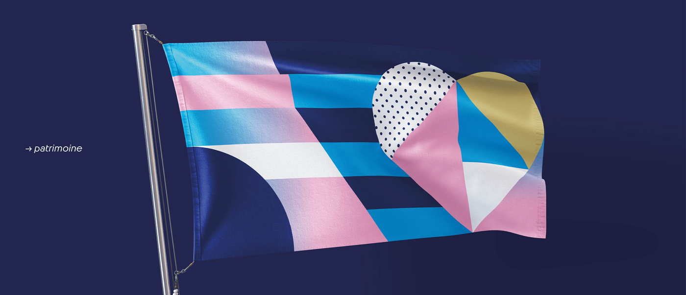
W Conran Design specialises in branding, architecture, communication and advertising – so the agency was perfectly equipped to create a distinctive brand identity for the 2024 Olympics in Paris. The Paris 2024 slogan is “Games wide open”. Although the branding references French culture, it is still flexible enough for all stakeholders to incorporate their own icons without losing the unified overall appearance.
Interview with W Conran Design
Red Dot: You crafted a creative system to suit every location, venue and sport. Why?
W Conran Design: Olympic Games branding usually consists of a single theme or set. We wanted to create a device that would be perfectly suited to the incredible backdrop of the city of Paris and tailor-made for each of its applications. The look of the Games is transformed into a visual vocabulary that allows stakeholders to add their own icons to the branding.
One of the central design elements is the cobblestone. Why is that?
Paris is a “revolutionary” city where many cobblestones have been thrown during demonstrations. In the design, they are the basic pixel in the composition of the sets. We created a regular geometric pattern as the visual anchor for all the designs. It’s a very structured piece of work, but it’s also highly imaginative.
Many of the competitions are taking place in the city centre. Did that influence your concept?
Yes, definitely. The heroes of these Games are Paris, the Grand Palais, the Esplanade des Invalides, the Eiffel Tower, Versailles and Tahiti. The branding needs to find its place in this unique setting. It is a subtle nod to the richness of French culture and adds sparkle and excitement to the Games without ever overpowering them.
Tell us more about the colour scheme …
It’s one aspect that particularly motivated us. We knew we had to work with three or four dominant colours, but we also tried to develop a palette rooted in the reality of the French territories. There’s a lavender blue, inspired by the landscapes of south-east France; a Sèvres blue, an expression of creativity and refinement; a coral orange, a brilliant celebration of Tahiti; a Matisse yellow for modernity and boldness; an opera green, like the oxidised roofs of Parisian buildings; a green like that of an oak leaf; the red of love, of course; and the grey of the zinc on the roofs of Paris. Overall, it’s very joyful and invigorating, but tempered by the desire to not be too loud in such a majestic setting.

