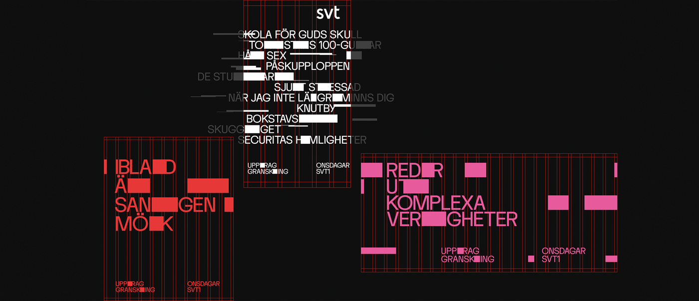
Uppdrag Granskning (Mission: Investigate) is a Swedish investigative journalism TV programme that exposes politically and socially reprehensible practices and criminal activities. The Dallas branding agency and its motion design specialists gave the TV programme a new look that centres on the brand essence – the act of unveiling the truth – and uses graphics to manifest it.
Interview with Dallas Sthlm
Red Dot: What main characteristics of Uppdrag Granskning is your design concept based on?
Dallas Sthlm: That’s simple: truth-seeking. The core brand identity is a visual representation of the process of shedding light on shadowy parts of society. And the “search lights” that move across the typography and content are the design element representing this search for truth.
The intention behind the design was to put the spotlight on reporting in a new way. How did you manifest that visually?
We wanted the branding to align with the content and have the perfect measure of personality. The identity was never intended to be perceived as an overlay to content. Instead, it is an integral part of the storytelling process. We achieved this with a seamless and dynamic animation that has a masking effect. Even though the graphics are big and bold, they never detract from content.
Why was typography so important?
Finding the right balance of design and content is crucial when you’re dealing with issues of a serious nature. The identity should never outshine the storytelling, yet the brand still has to be clearly recognisable. Typography is an important brand element because it automatically conveys a message. FK Display is a font for serious conversations, with a bit of zing added to some of the glyphs for recognisability.
How challenging was it to make the identity work across all formats and screens?
Siding with truth and integrity eliminates the need for any special effects, yet it is still important to hold one’s ground in the chaotic worlds of TV and social media. That’s why we created a graphic packaging that is distinct from the people and images – it should never be unclear what is branding and what is content. The “search lights”, our identity catalyst, connect the brand footprint across all platforms.
What was the most fun part of this project?
Our client placed a lot of trust in us, and that meant we could take a playful approach to the design process. The animations and brand elements mutually create a dynamic that makes the identity resonate. This is the very essence of animated graphic design, and we’re immensely proud of it.

