Communication design on the highest level: excellent Retail Design
The Red Dot Award: Communication Design 2017 is well underway. Agencies, designers and companies from all over the world are currently called upon to submit their well-designed and creative works and projects from the field of communication design. A total of 18 categories are available for participation, one of them is “Retail Design”.
Whether in shops, cinemas or bars, in recent years retail design has become increasingly important. One reason for this was the increasing sales in online trading. In response, purchasing on-site should become an experience. And retail design is more than just interior design. For a successful retail design, in addition to the interior furnishings, spatial planning, branding and the presentation of the goods are coordinated in a way that the visit becomes an experience. In the Red Dot Award: Communication Design 2016 the Nike Studio Bejing and the Aesop Signature Store in Munich were awarded.
Comprehensive brand experience in the Nike Pop-Up-Space
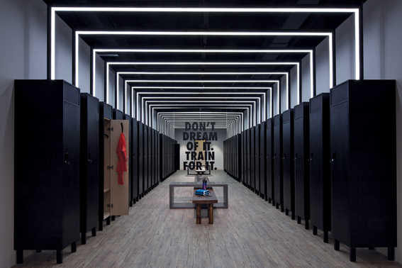
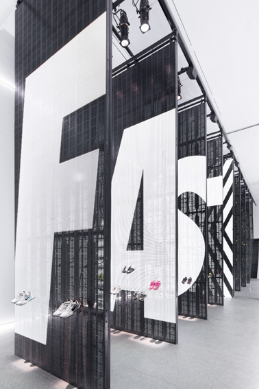
Nike Studio Beijing is a pop-up space constructed within a 1,200-sqm gallery in downtown Beijing. The aim was to create a workout area and retail exhibition that tied together seamlessly. Based on the Nike philosophy that everyone is an athlete, the guiding principle of the interior design concept was to create an atmosphere of “infinity and empowerment”. The entire store space was designed to evoke as emotional of a response as possible from visitors. Therefore, the workout area was rendered almost entirely in black so that it created a strong contrast against the free-floating exhibition spaces. Other areas included a lounge as well as lockers and washrooms with Nike adages emblazoned across the walls. Visual references were made to track and field elements, which were used to display featured products.
Red Dot: Best of the Best for Nikes Retail Design
The Red Dot jury was impressed by the project and appreciated the performance with the Red Dot: Best of the Best: “This pop-up store impresses by making the brand come vividly to life within a strictly limited space and timeframe. It offers many different experiences in the narrowest of spaces, backed up by a consistent design idiom that both stages the various areas individually and connects them harmoniously with each other. The result is a comprehensive brand experience that leaves a lasting impression on visitors.“
Highest brand quality presented in Munich
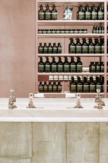
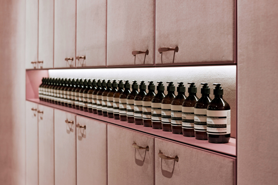
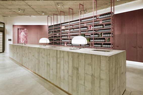
The first Aesop signature store in Munich, located in the historic Luitpoldblock shopping centre, exudes an atmosphere that moves between tension and harmony. Presenting the high-quality care products by this Australian brand, it combines brutalist elements such as the over-dimensional monolithic counter made from cast concrete with inlaid washbasin, or the tiered concrete ceiling and rough screed floor. Thus, surfaces that are touched by the customer were designed to feature velvety polished marble. Vertical brass trapeze forms in front of the window supporting slim shelf boards made of Carrara marble as well as bronze elements and shiny velvet panels on the walls enhance the overall atmosphere of luxury and elegance and are reminiscent of the intimacy of a boudoir. The antique furniture invites visitors to linger, while a concrete washbasin area in the adjacent space offers the possibility for extensive customer consultation.
Red Dot: Best of the Best for Aesops flagship store
The jury was particularly impressed by the combination of materials and the luxurious impression and awarded the Aesop store in Munich a Red Dot: Best of the Best: “The Aesop signature store in Munich manages to create an impression of the highest quality through the skilful use of comparatively simple means. The successful interplay of contrasting materials such as raw concrete and screed on the one hand, and finest marble and velvet on the other, as well as the use of soft, powdery colours, all contribute to creating an exciting yet harmonious atmosphere of contemporary luxury.”
Red Dot Award: Communication Design 2017
For 25 years the Red Dot Award: Communication Design has provided agencies, designers and companies from all over the world with a platform for the evaluation of their design and creative achievements. They are currently invited to submit their works and projects into the international competition, which is being launched in 18 categories. A 24-member jury will evaluate every single entry individually and award the Red Dot seal exclusively to those who convince with good design quality and creativity. The “Latecomer” registration phase runs until 9 June 2017.
» Further informationn on the Red Dot Award: Communication Design 2017
