Communication design on the highest level: excellent Annual Reports
For 25 years the Red Dot Award: Communication Design has provided agencies, designers and companies from all over the world with a platform for the evaluation of their design and creative achievements. A total of 18 categories were available for participation, one of them is “Annual Reports”. In 2016, among others, the adidas Group Annual Report 2015 and the HOERBIGER Yearbook 2015 / 2016 were awarded the Red Dot: Best of the Best.
Annual report magazine with foresight
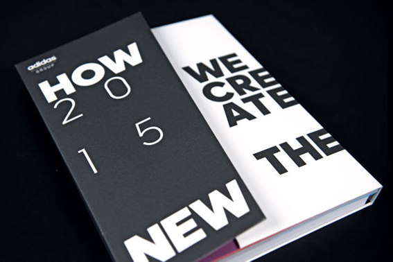
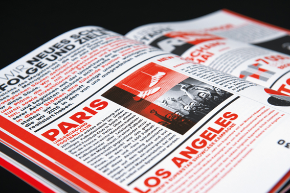
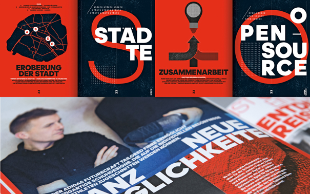
Under the title “How We Create the New”, this annual report sets out to introduce the “Strategy 2020” by the adidas Group. The reporting comprises a magazine and the actual report, interpreting the strategy by focusing on the issues of “how we create the new” and “how we create value”. The Group‘s sustainability report follows the same pattern with „how we create responsibly“. The aim is to give concrete answers to what is to be achieved within the 2020 targets and how the adidas Group wants to create the “new”. The magazine thus presents initiatives and approaches that the adidas Group has launched and tracked. In addition, the first successes in 2015 regarding adidas‘ three strategic choices of “Speed”, “Cities” and “Open Source” are presented. The content is visualised through a deliberately striking design complemented by powerful images. The dynamic appearance of these publications is achieved through the use of different materials and the principle of a slanted cut.
Jury honours performance with the Red Dot: Best of the Best
The annual report for the adidas Group designed by Strichpunkt Design from Stuttgart and Berlin, Germany, was awarded the top individual award Red Dot: Best of the Best. The statement by the jury about this decision: “The design of the adidas Group annual report successfully manages to lend each page an ¬exciting rhythm, turning the pages into perfect compositions that each tells their own story. Typographic elements are used as illustrations to impressive effect, while a sans serif font is used on the image level. Opting for reduction, the colour design comprises beautiful grey tones and embodies a convincing implementation.”
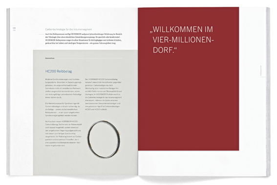
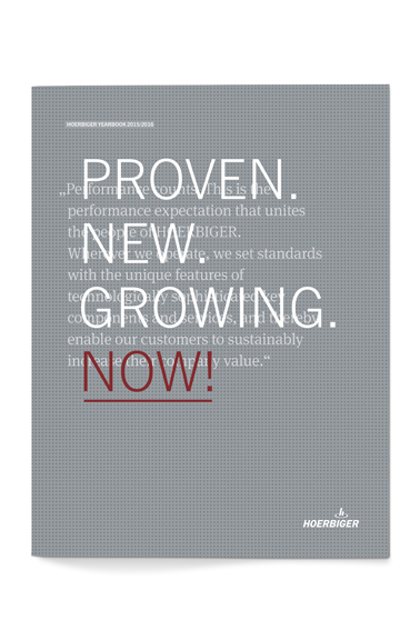
Yearbook with focus on the employees
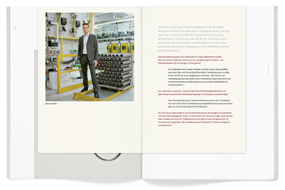
The “HOERBIGER Yearbook 2015 / 2016” by HOERBIGER Holding AG focuses on communicating the performance claim that binds all people working at the company. Furthermore, it also aims at promoting the company that sets standards with technologically challenging key components and services. At various points, the yearbook introduces employees from the different corporate divisions as well as representatives of the corporate management team. On four-page inserts, they present their developments, describe the essence of their work and talk about their drive and motivation. The introductory pages of the inserts, which are kept in a warm red tone, form the bridge with their clear statements from the text level of the yearbook to the people shaping the company. The typographic look has been fundamentally revised and renewed. Considerably stronger emphasis has been placed on the use of the corporate colour red, which stands for the people.
Top individual award for the 2015 yearbook
The yearbook by HOERBIGER Holding AG designed by Jäger&Jäger from Überlingen, Germany, was awarded the Red Dot: Best of the Best 2016. The jury said: “The HOERBIGER yearbook fascinates with an unobtrusive, yet distinctive cover design, as well as with a clear and consistently implemented page layout on the inside. The concept of shorter ¬insert pages is particularly convincing, as they liven up the layout to appealing effect. The overall impression is rounded off by the use of beautiful and subtly refined paper.”
» Further information on Red Dot Award: Communication Design 2017