"ag Type Specimen" – a typography masterpiece awarded with the Red Dot: Grand Prix 2015
In 2015, Ahn Graphics was awarded with the Red Dot: Grand Prix for the typography artwork “ag Type Specimen”. The renowned experts of the Red Dot jury stated: “This typography design traces the history and development of Hangul, the Korean alphabet, its development from Chinese characters and the establishment of traditional Hangul up until today. Published as five high-quality volumes, each with a clear design arrangement, the work has emerged as a creative and innovative solution which not only transports the traditional system into our time, but is also a pleasure to read and leaf through.
Each volume presents a different design concept
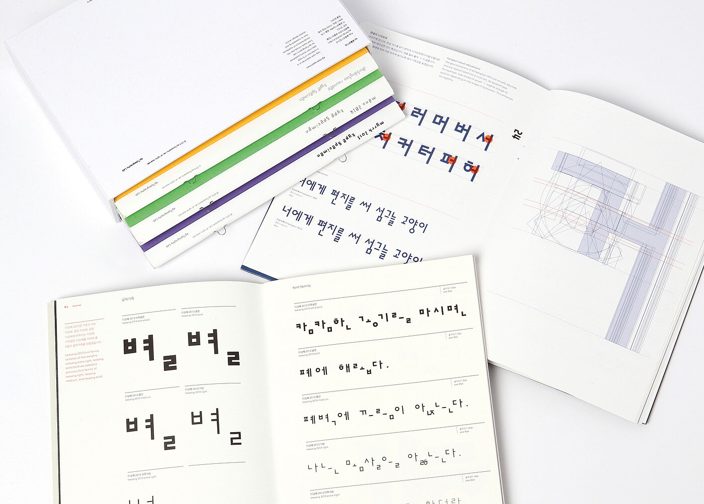
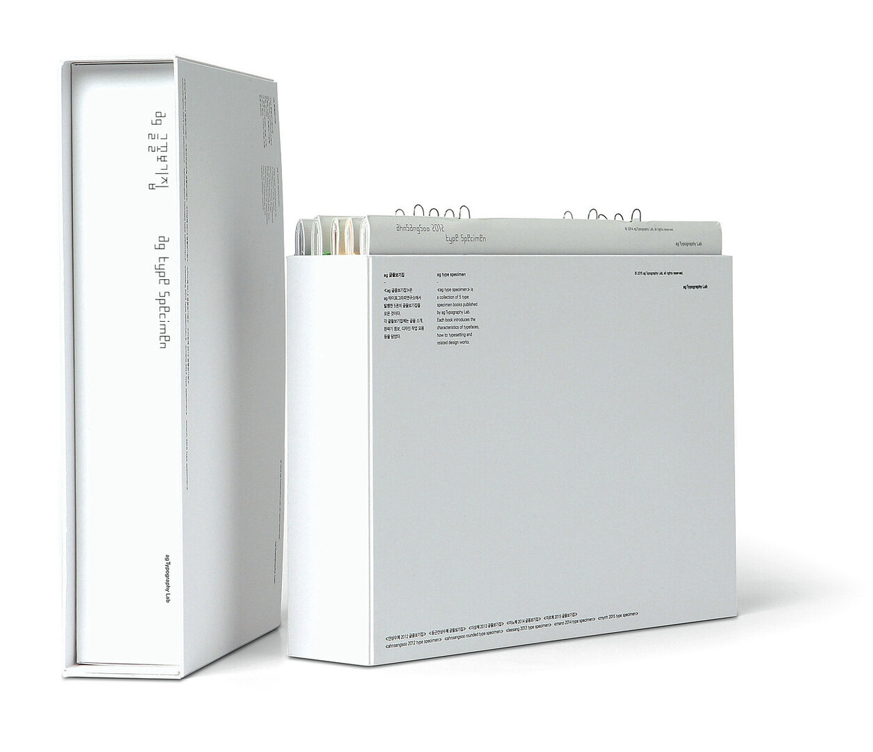
“ag Type Specimen” is a collection of five books introducing a full-scaled typography that spans the entire design process. The volumes cover the descriptions of Ahnsangsoo 2012 Type Specimen, Ahnsangsoo Rounded Type Specimen, Leesang 2013 Type Specimen, Mano 2014 Type Specimen and Myrrh 2015 Type Specimen, all published by ag Typography Lab. The Hangul typefaces in this collection were all designed by Sang-Soo Ahn between 1985 and 1991 and have been improved by ag Typography Lab.
The contents not only comprise an introduction to the Korean alphabet, known as Hangul, the type families, the Roman alphabet and numerals, as well as symbols and visual adjustments, but also show examples applying the use of these typographies. The texts are written in both Korean and English. The covers are made of solid coloured cardboard with a silkscreen print of a major consonant from each typeface. Each volume presents a different design concept that emphasises the respective character of the typeface presented. The edition comes with a specially created slipcase and is limited to 100 copies.
Red Dot: What motivates you?
Ahn Graphics: Letters and text. The combination of letters is one of the most important concerns when dealing with editorial design. In fact, Ahn Graphics rooted itself in the idea of font design. In line with our thinking, we put letters at the centre and then brainstorm all of our design ideas on that basis. Thus, we can say that letters and texts are our motivation and outcome at the same time.
What is your personal key to success?
We not only focus on the outcome of our design work, but also put emphasis on the process. So we put our best efforts into design suggestions, such as providing our clients with paginations, with the utmost detail. When necessary, we do not hesitate to repeat things to achieve the best result.
Can you name a designer who has changed the world?
Sang-Soo Ahn. He established Ahn Graphics in 1985 and left in 1991. However, he still remains as the basis of today’s designs of the company.
» Further information on the Red Dot Award: Communication Design