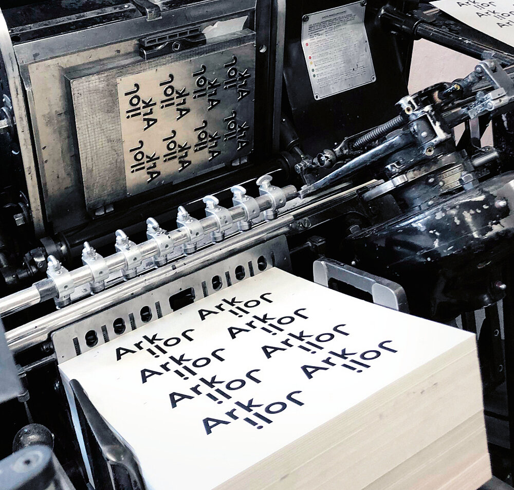
The ethos of the Swedish architectural office Joliark is to make architecture see the bigger picture. They are not afraid to turn things on their side to unlock new ideas. With typography turned upside down, the brand identity captures this approach. Signs with changing dimensions honour Joliark’s ability to find solutions by zooming in and out of problems. This, together with subtle geometric fonts, embraces the feeling of modern architecture, but with a twist, while the colours, in harmony with the nature of the material, evoke a feeling of style and elegance.