Brand Design

Sikinnis

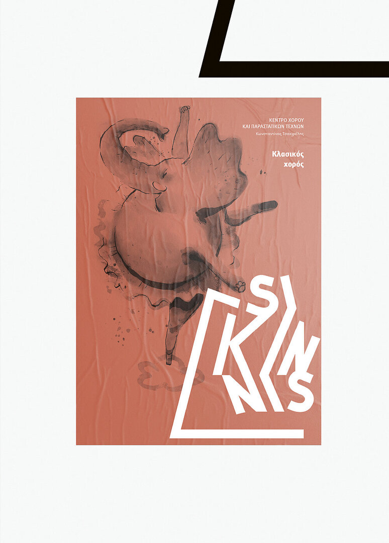
Sikinnis is a newly founded dance and performing arts centre whose name refers to the dance of the chorus in ancient Greek satyric drama. This contemporary establishment warranted a boldly designed logo that expresses both movement and the solid structure of the building. The logo was created by transforming every turn in the heavy font into a pivot point, giving the final structure a sense of movement captured in a snapshot rather than an overly static look. Complementing this structural design with gestural illustrations that present, among other things, characters from past performances, the brand design exudes a personal touch.

Credits
-
Client:Sikinnis, Heraklion, Greece
-
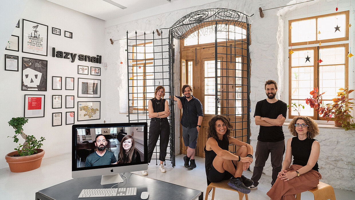
Design:Lazy snail Design, Copenhagen, Denmark
-
Project Team:Lazy snail Design: Ioanna Drakaki (Head of Design) Eleni Pavlaki (Creative Director) Serafim Stroubis (Senior Art Director) Carolina Salassa (Art Director) Kostas Kiriakakis (Illustrator)
Nikolas Leventakis (Photographer)

