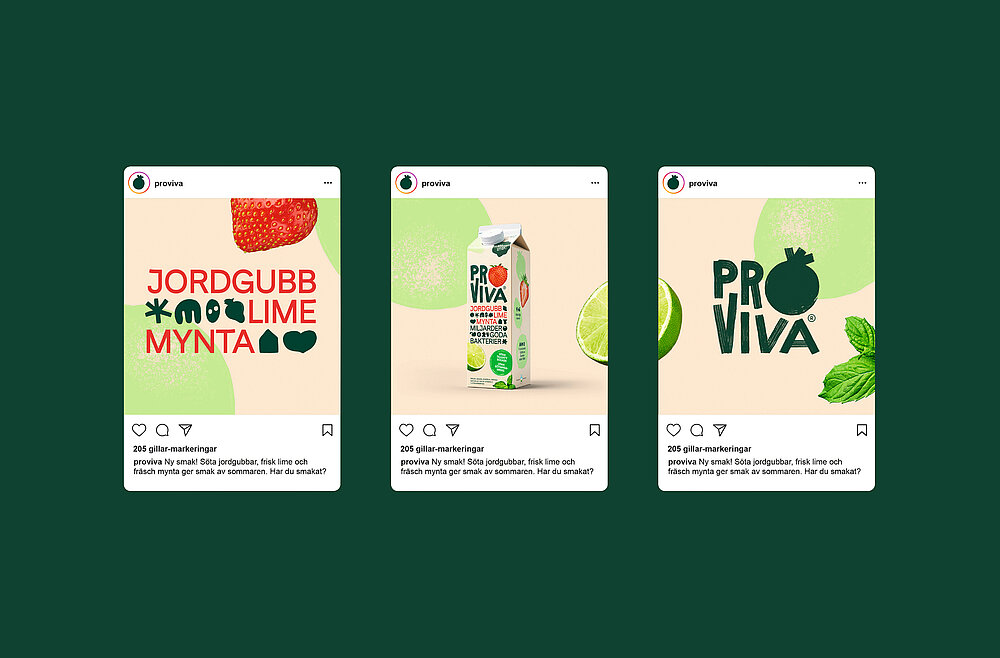
Since its launch in the early 1990s, ProViva has grown into a well-known brand in Sweden, with drinks that are particularly popular with older consumers. A new brand design was developed to appeal to a younger audience and enable better differentiation of the products. The result is a complete overhaul of the brand strategy, visual identity and packaging design. The new logo is simpler and more flexible so that it can be combined with fruit imagery. The visual language includes various fruity and bacteria-like key visuals, while five primary colours characterise the wide product range.